plugg CASE STUDY
Problem Solution Designs Outcome ← Back to portfolio
E-commerce · On-demand delivery

Ordering vape & cannabis
without the friction.

Plugg is an on-demand storefront for a regulated, hand-delivered category. I rebuilt discovery and checkout so a first-time buyer can go from landing page to placed order in three clear steps on desktop or a phone.
Role
Lead Product Designer · UX/UI
Timeline
2019 · 8 weeks
Platform
Responsive web + mobile
Scope
Storefront · Checkout · Payments
+32%
Checkout completion
−24%
Cart abandonment
5 → 3
Steps to purchase
+41%
Mobile add-to-cart
Directional — moderated usability testing + first-month launch analytics.
plugg.co
⤢ Zoom
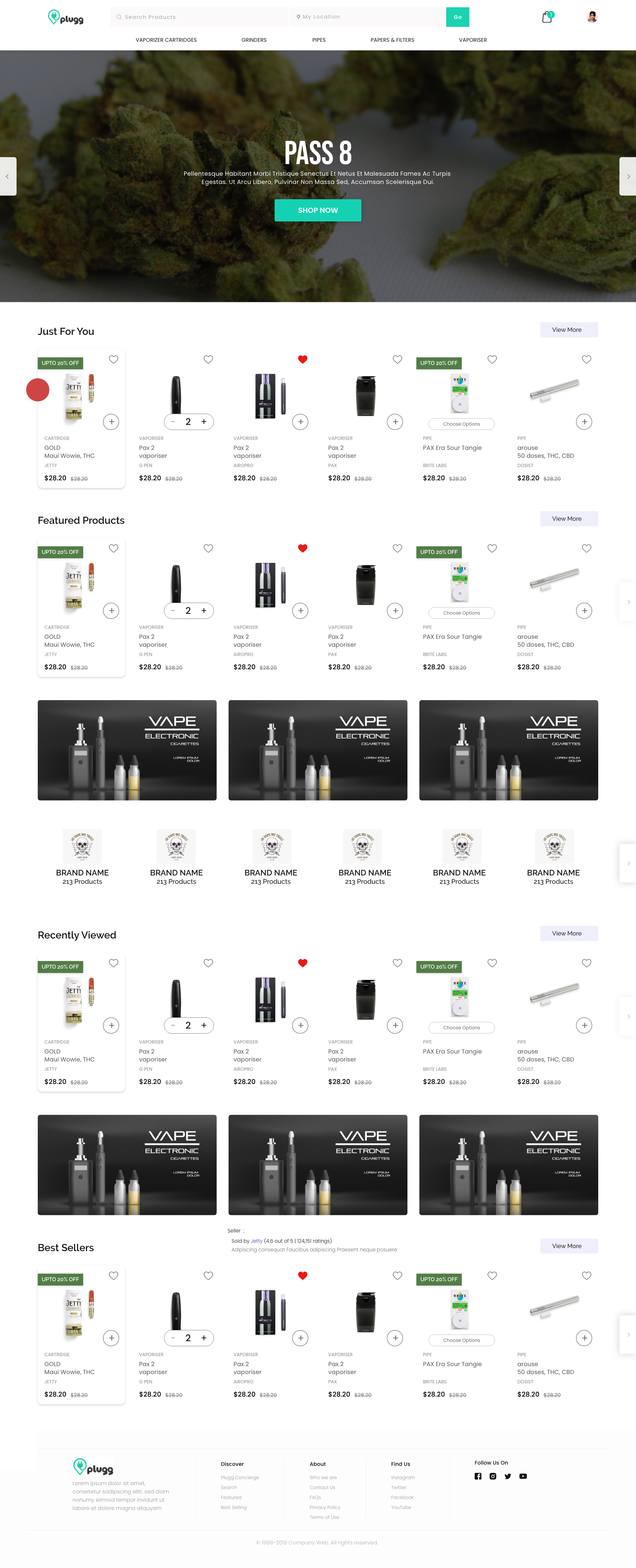
Plugg desktop storefront
The storefront — curated discovery for a catalog of near-identical products.
The Problem

A category where everything looks the same, sold through a checkout people couldn't finish.

01
Undifferentiated catalog

Carts, pens and cartridges looked identical in one long grid. Shoppers couldn't tell options apart and bounced before adding anything.

02
Checkout spread across screens

Address, timing and payment each lived on a separate page. The running total kept disappearing, so trust dropped at the worst moment.

03
Regulated & cash-heavy

An age-restricted, hand-delivered product with a privacy-conscious, often cash-paying audience — card-only flows excluded real buyers.

The Solution

Guide the buyer end to end — curate discovery, then collapse checkout into one confident page.

A
Discovery by intent

Intent-based rails — For You, Featured, Best Sellers — replace the wall of grid cards.

B
One-page checkout

Address → Time → Payment as numbered steps, with the price summary pinned the whole way.

C
Pay any way

Card, cash-on-delivery and wallet as equals, so payment is never the reason to quit.

Key Designs

Each screen, and the call behind it.

Every design is paired with the problem it solved, the decision I made, and what changed.

Click any screen to zoom — then use the arrows to browse every design.
⤢ Zoom
Plugg storefront rails
01Storefront

Curated rails instead of an endless product wall.

ProblemA single grid of look-alike cartridges made every option feel the same — people left without engaging.
DecisionBroke the catalog into intent rails — Just For You, Featured, Recently Viewed, Best Sellers — with quick-add controls on every card.
ImpactA faster path to the first add-to-cart; longer browse sessions, lower bounce.
02First Order

A first order that doesn't feel like paperwork.
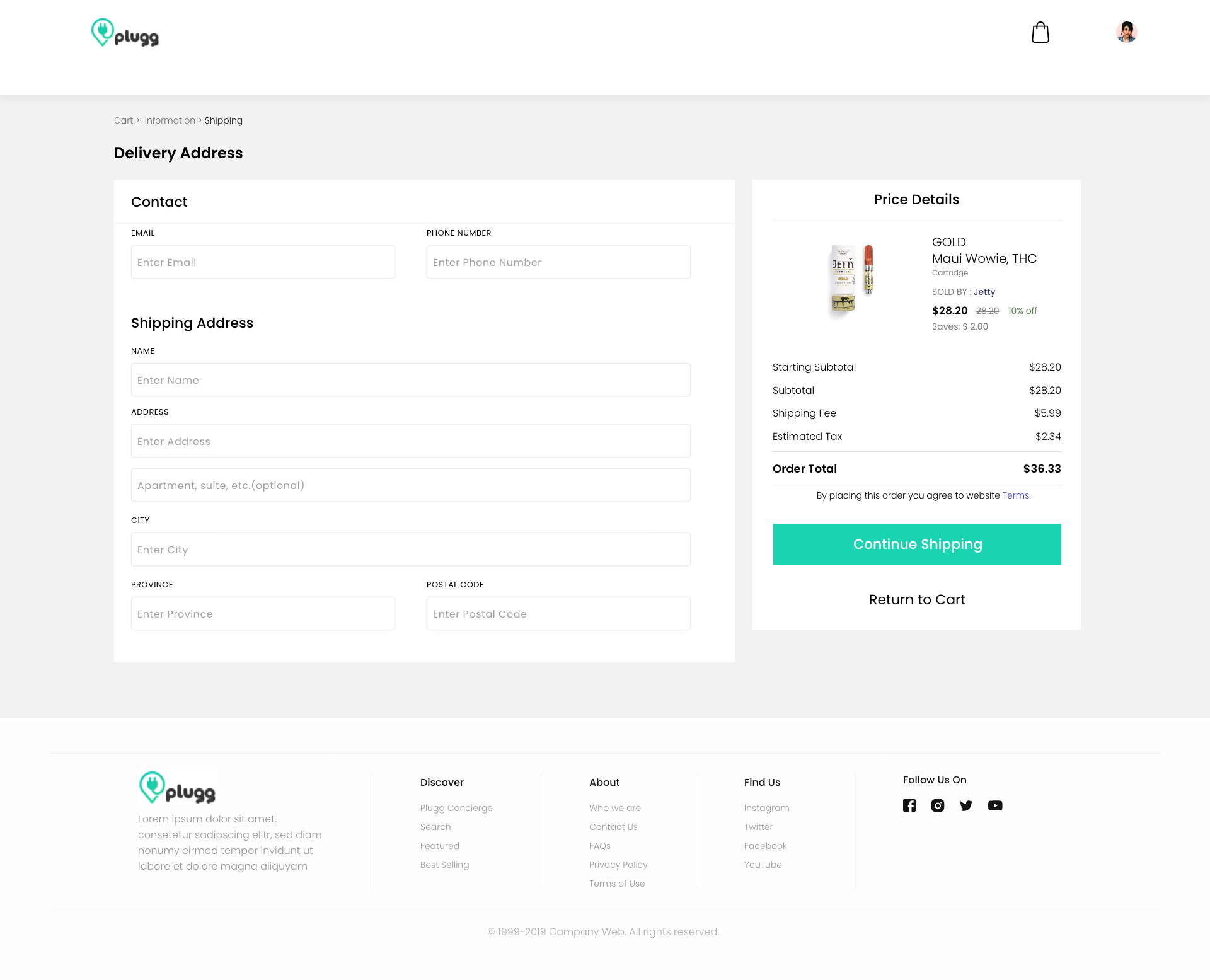
ProblemFirst-time buyers met a long, blank form with no sense of progress or what came next — easy to abandon mid-way.
DecisionSplit it into clear Contact and Shipping groups, added a Cart › Information › Shipping breadcrumb, and kept the live order total beside the form so it feels finite.
ImpactNew buyers finished their first order with less hesitation and fewer mid-form drop-offs.
⤢ Zoom
Plugg first-order checkout form
⤢ Zoom
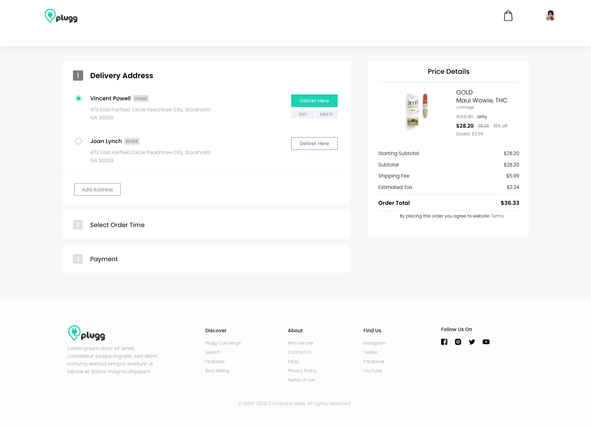
Plugg guided checkout — address step
03Guided Checkout

One page, three numbered steps, one running total.

ProblemAddress, time and payment lived on separate screens — buyers lost the thread and the price vanished between pages.
DecisionCollapsed checkout into a single accordion with numbered steps and a Price Details card pinned to the right at all times.
ImpactFewer steps, fewer drop-offs, and no surprise total at the end.
04Saved Addresses

Returning buyers order in one tap, not one form.
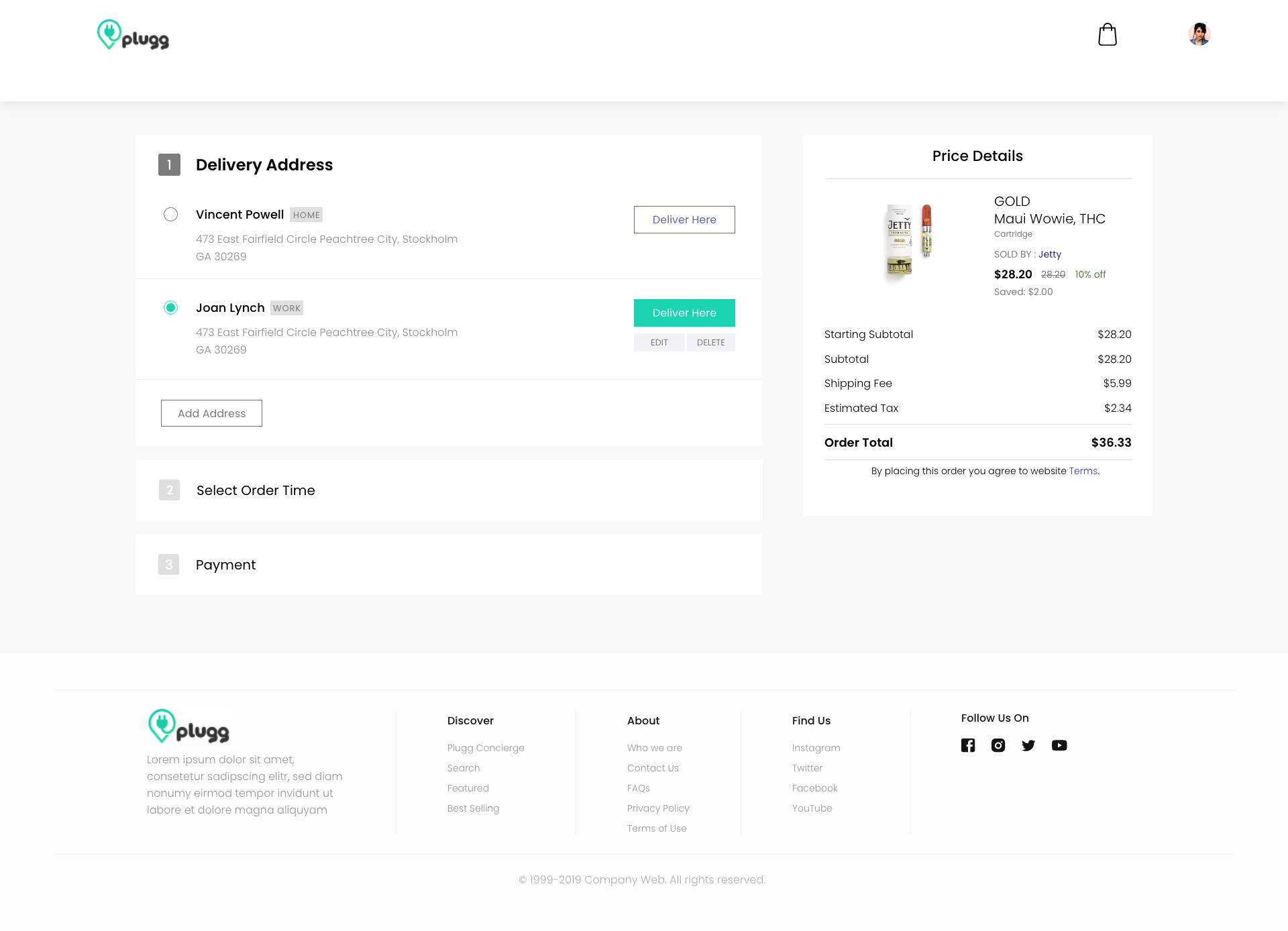
ProblemLoyal customers re-typed the same address every order — friction that punished exactly the people who ordered most.
DecisionA saved address book with Home / Work labels, inline Edit and Delete, and a single Deliver Here to pick — no retyping.
ImpactRepeat checkout got far faster and nudged more buyers toward reordering.
⤢ Zoom
Plugg saved address book
⤢ Zoom
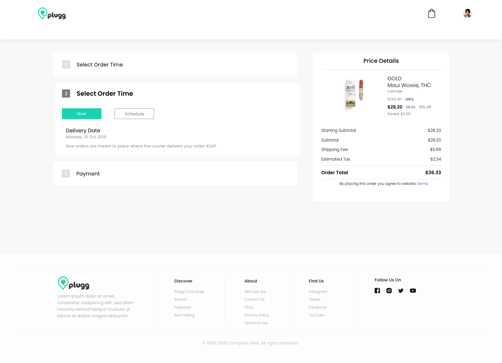
Plugg delivery timing — now or schedule
05Delivery Timing

Set expectations on a courier-delivered product.

ProblemCustomers had no idea when an order would actually arrive — risky for an age-restricted, hand-delivered category.
DecisionA plain Now / Schedule switch, with the delivery date stated in everyday language right under it.
ImpactClearer expectations up front and fewer “where's my order” tickets after.
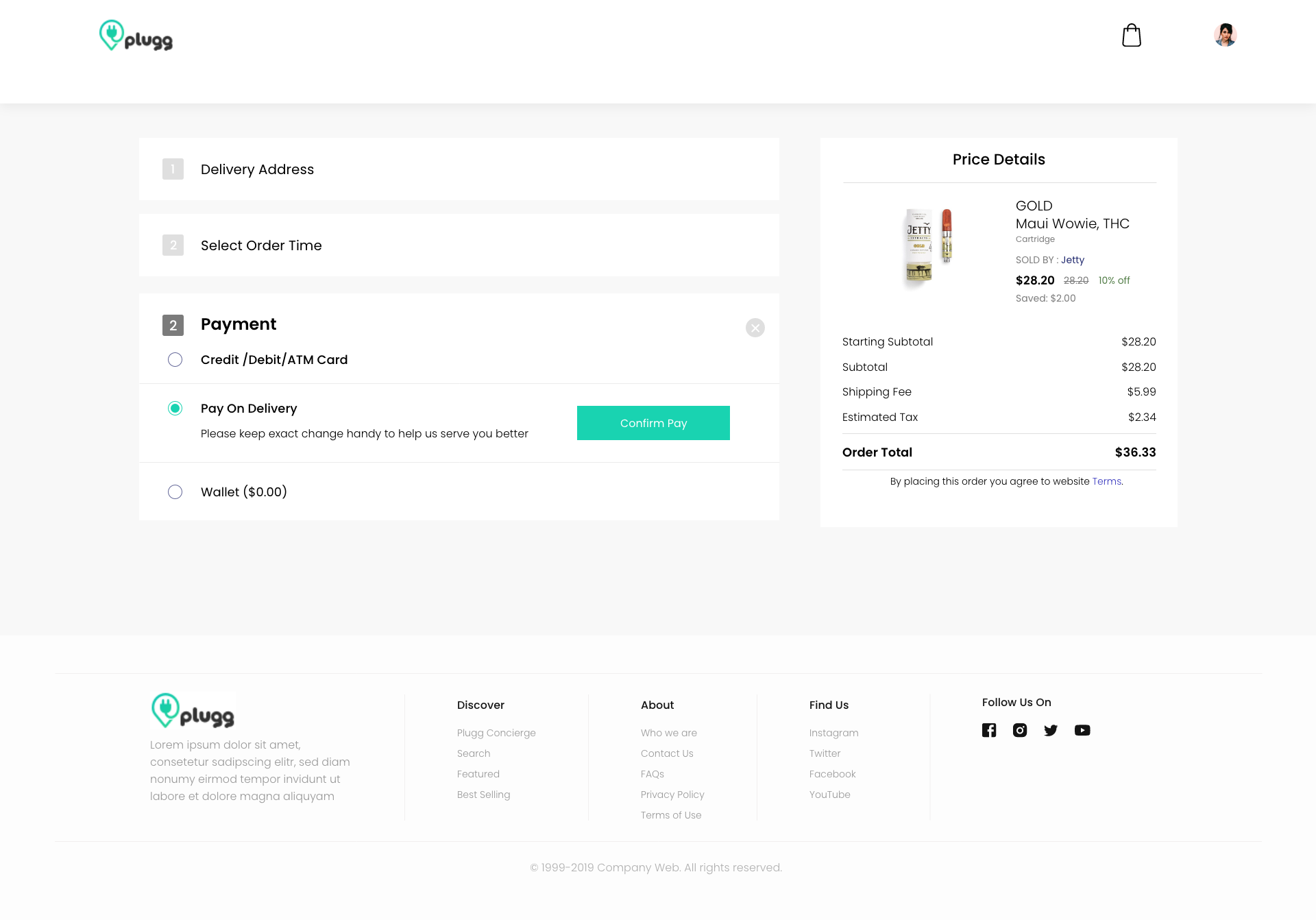
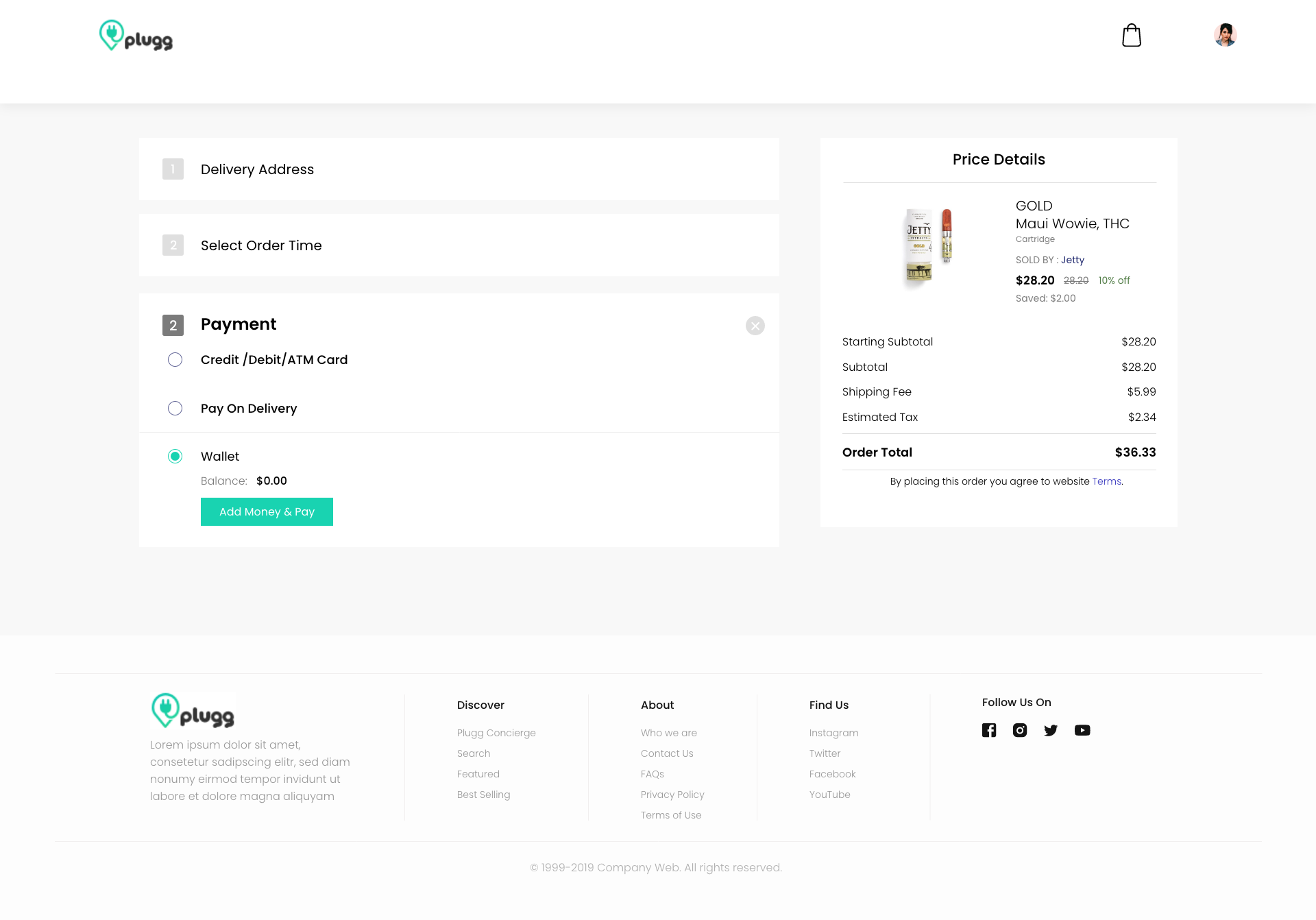
06Flexible Payment

Card, cash, or wallet — payment is never the reason to quit.
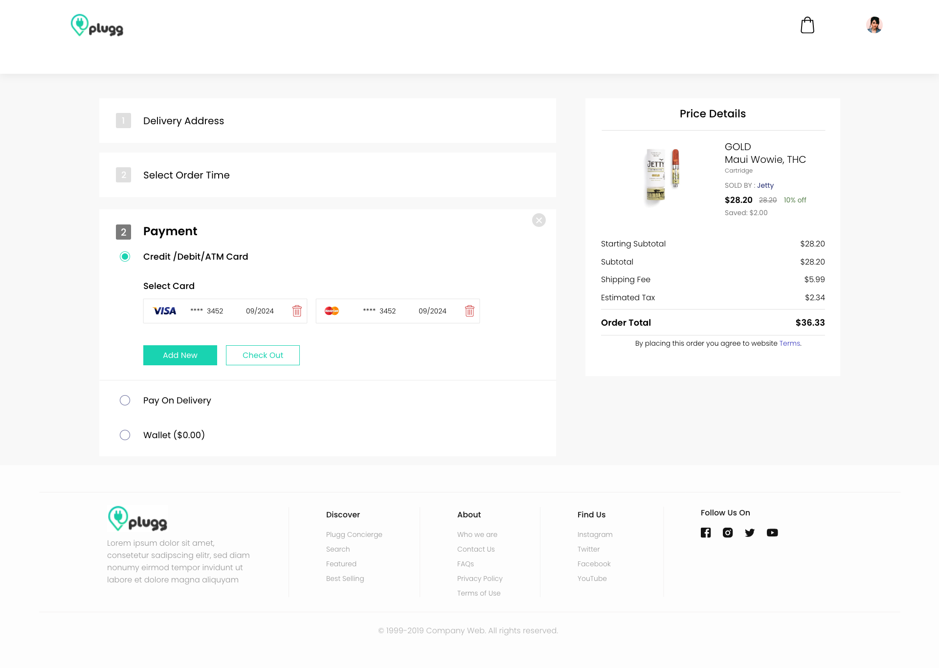
ProblemA card-only checkout shuts out a cash-heavy, privacy-conscious audience — a top abandonment cause.
DecisionThree equal options — saved Card, Pay on Delivery, Wallet — each confirming inline with no extra screen.
ImpactRemoved a leading drop-off reason and widened who can actually check out.
⤢ Zoom
Pay with saved card
Saved card & checkout
⤢ Zoom
Pay on delivery
Pay on delivery
⤢ Zoom
Wallet balance
Wallet balance
07Mobile

The same system, re-thought thumb-first.

ProblemThe desktop catalog didn't survive the jump to a phone — tiny targets and buried actions.
DecisionRe-flowed the rails into swipeable rows with a persistent bottom nav and full-width Add buttons in thumb reach.
ImpactMobile became a first-class buying surface, not a shrunk-down desktop.
Plugg mobile storefront
Plugg mobile categories
Outcome

A storefront people could read and a checkout they could finish — on any device.

+32%
Checkout completion
−24%
Cart abandonment
5 → 3
Steps to purchase
+41%
Mobile add-to-cart

If I revisited it: layer in age-verification earlier in the flow and personalize the rails from real order history — the structure was built to absorb both.

plugg
Plugg e-commerce case study · Product design ← Back to portfolio
{{ counter }}
PREV
NEXT
{{ media }}
{{ curCap }}
Use the arrows (or ← →) to browse · Esc or tap outside to close